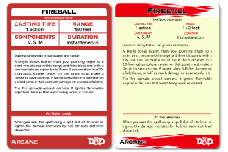
 I was disappointed with the design of the 5th edition Dungeons & Dragons spellbook cards from Gale Force Nine, so I took a stab at redesigning them. My write up discusses the choices I made as I went.


 I was disappointed with the design of the 5th edition Dungeons & Dragons spellbook cards from Gale Force Nine, so I took a stab at redesigning them. My write up discusses the choices I made as I went.
totally agree and love your take on it. I’d love to see your design with content from one of the longer spells (animate dead?) to see how it looks.
I prefer the originals by Gale Force Nine. They are a lot quicker to scan by eye and therefore more useful to me. I prefer the grid on top for the pertinent info with bolder labels. I find putting the spell name and magic type over the D&D flame identifier doesn’t work either. Just my two bits.